Bitcoin mania is seizing the world, and as we approach the end of the first week of bitcoin futures trading on the CME, I thought it would be timely to take a look at what the cycles are doing in bitcoin, and answer one of the most frequently asked questions that we have received recently: “Are Hurst cycles active in the price of bitcoin?”
Bitcoin is effectively a new form of money, unusual in that it is separate from banking institutions, and governments. As such it is often described as being something that has no “intrinsic value”. One could argue whether any form of money actually has intrinsic value (read this excellent article which touches on that issue, and explains how bitcoin fits into the picture), but for the purposes of this blog post we will skip that abstract discussion and go straight to the heart of the matter: let’s see if we can find any evidence of cycles influencing the fluctuations in the value of Bitcoin.
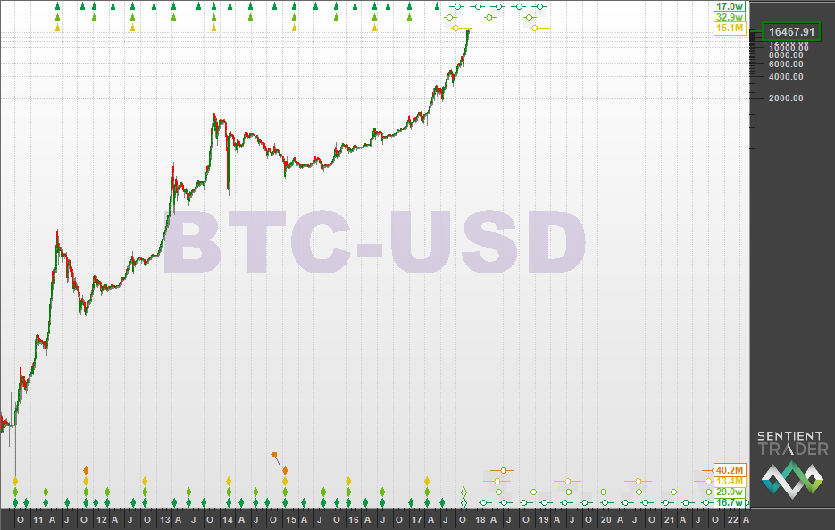
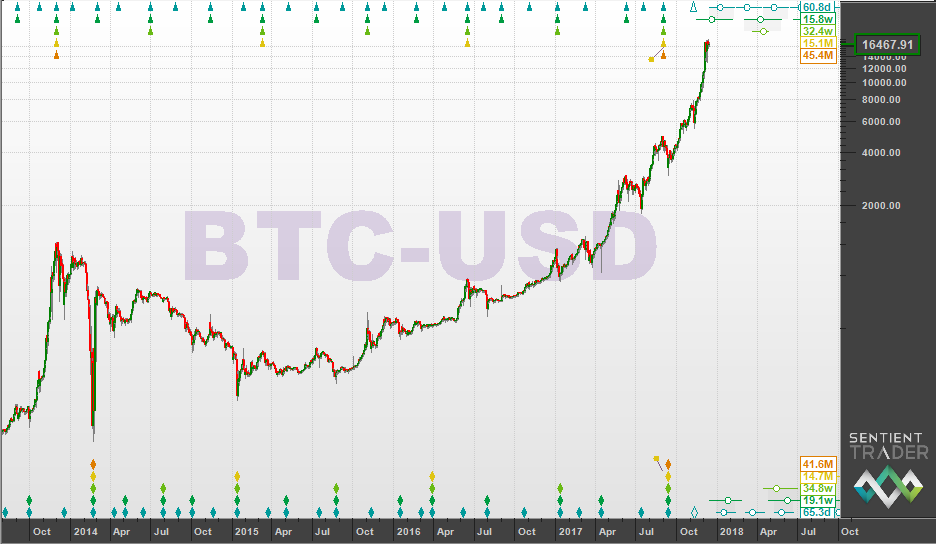
First of all, a chart which is not very useful, and which might seem to deny the presence of any cycles in Bitcoin, showing the recent meteoric rise in the value of Bitcoin in terms of the US dollar:
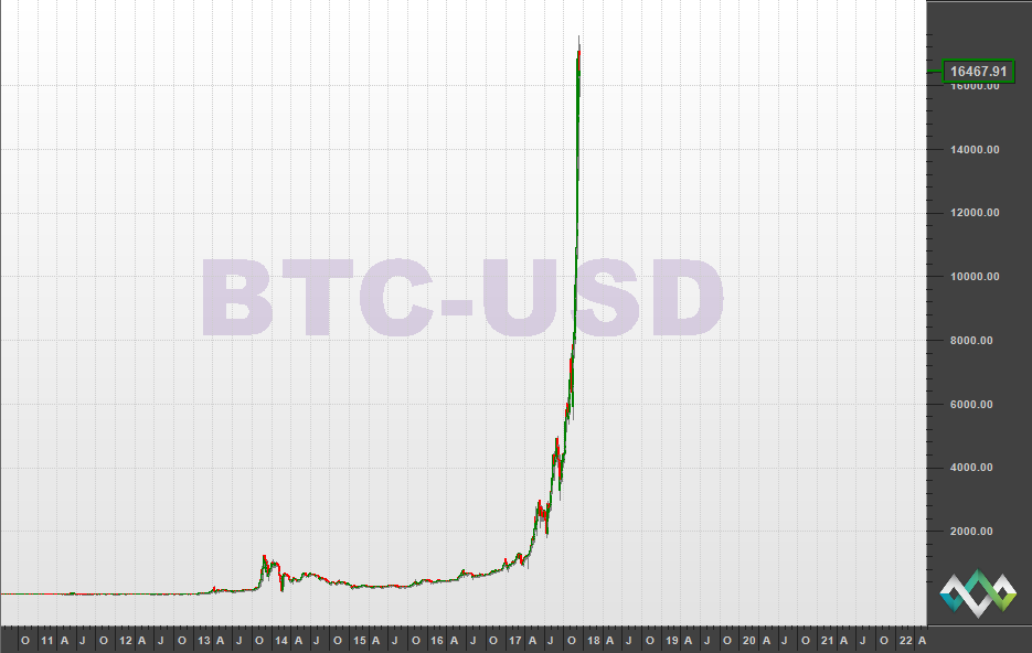
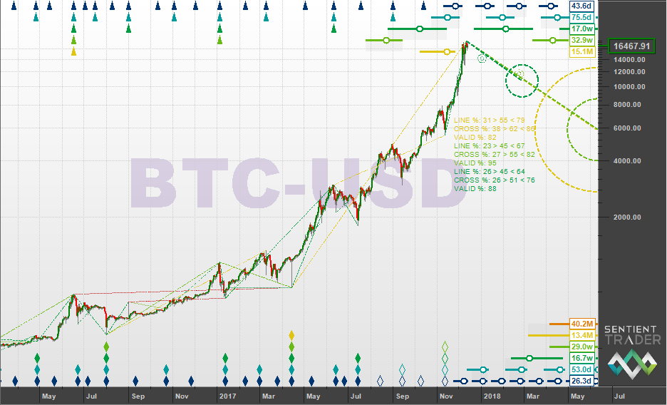
That is of course a linear chart (equal increments on the y-axis represent equal amounts of price, as can be seen on the price scale), and I show it here as a lighthearted way of demonstrating how one should not start looking for cycles in the price movement. Here is a more useful chart, plotted on a logarithmic scale (equal increments on the y-axis represent percentage moves as opposed to absolute price values):
The first question that we need to ask when looking for the evidence of cycles (in particular Hurst cycles) influencing the price movement of a market, is whether those cycles are synchronized at their troughs or at their peaks. One of Hurst’s cyclic principles is the Principle of Synchronicity which states that the cycles that influence the price movement (of stock markets) are synchronized where possible at their troughs. Bitcoin is not a stock, and so we should not assume that the troughs are synchronized. There is good evidence that commodities and precious metals are influenced by cycles that are synchronized at their peaks, and forex pairs exhibit the characteristics of either peak or trough synchronized cycles, or in some situations a combination of both.
And so the first thing that I do when performing a cycle analysis is to perform a simple visual check of the price data to determine whether we should be looking for synchronized peaks or troughs. When the cycles are synchronized they form sharp and isolated turning points (either peaks or troughs). Conversely on the other side the turns would be generally rounded and clustered. The determination of a peak or trough synchronization is not an absolute science, and most instruments will exhibit some characteristics of both. However in my opinion Bitcoin demonstrates more of a peak synchronized situation than trough synchronized. In particular that rounded and accelerating move up from the beginning of 2015 would certainly seem to indicate that the cycles influencing the market at the moment (if indeed there are any) are synchronized at their peaks, because that rounded formation is the kind of thing that one sees in markets with synchronized peaks as the market rises up to the peak of a fairly significant cycle.
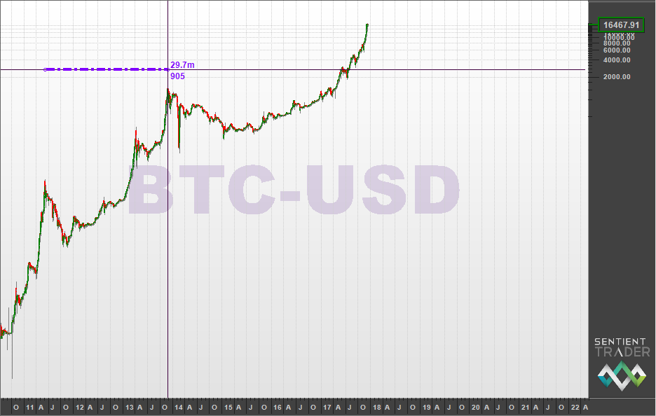
I have also measured on the chart above the distance between two of the most prominent peaks, in 2011 and 2013. The distance, as you can see is 29.7 months. That is not a particularly significant measurement in itself (one can hardly claim that there is evidence of cycle influence on the basis of a single measurement) however we do know that one of the cycles in Hurst’s nominal model is the 17.9 year cycle, which many Hurst analysts believe has been “running short” recently and is better stated as a cycle of about 14-15 months. That is of some interest, but at this stage it is no more than a possible indication that we should adopt a shorter nominal model in this analysis. And that is what I have done, by applying the now fairly well known nominal model based around the 42-month cycle (see posts by William Randall and John Oestreich).
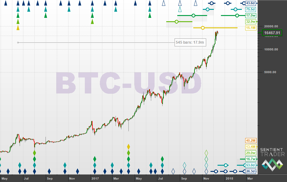
And here is that analysis, which shows a “dual” analysis: both a peak analysis and a trough analysis. In my opinion the peak analysis is better (a quick and easy way of determining this is to see how well the peak triangle markers line up with peaks in the price). The trough analysis is not as good, which in my opinion supports the idea that the peaks are synchronized in this market.
You will notice that I have moved the 42-month trough from the very sharp trough in early 2014 to the trough in early 2015 (that pin symbol shows that). This is because it is my opinion that a major trough of a cycle is better placed at the end of a “triangle” formation, instead of at the end of the initial and strongest move down in that formation. Because I have moved that 42-month trough, the analysis indicates that the next big trough that is expected to form will be of magnitude 42-months (at least, possibly much greater), and is expected in the middle of next year, 2018. If I had not moved that 42-month trough, then the 42-month trough would be placed at the position of the 14-month trough in April 2017. Positioning such a major cycle trough in the midst of that bowl-like accelerating bull move is dubious at best, although we will take a look at an example a little later which might make sense out of that placement.
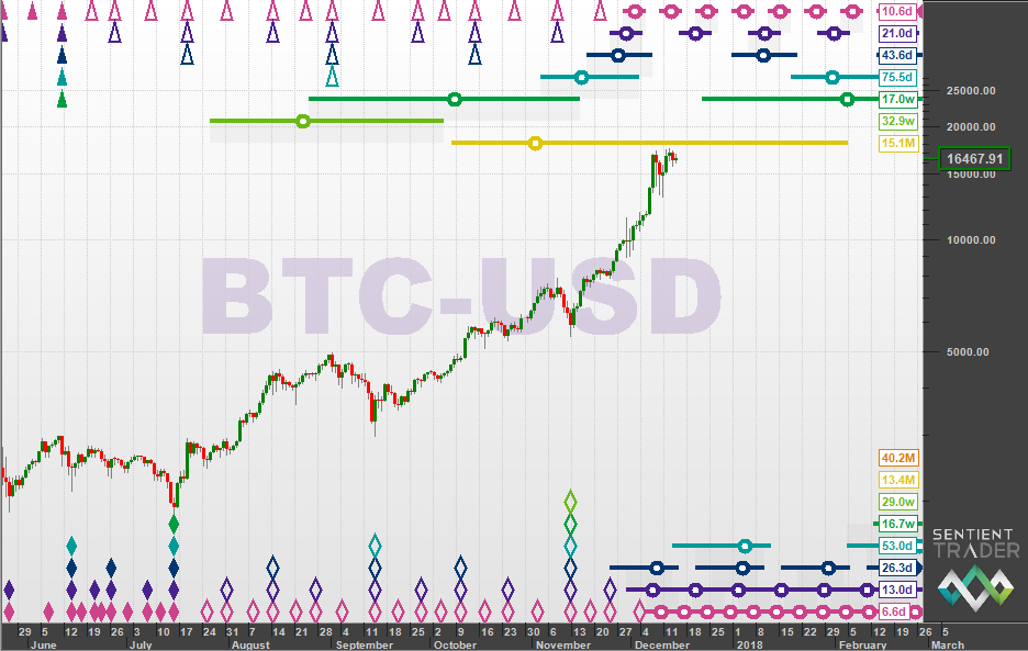
Now let’s turn our attention back to the peak analysis, and ask whether it provides us with an answer to our question. Are there cycles influencing this market, or have we simply analyzed a random price movement? I am what might be described as a “visual analyst”, which generally means that I rely on a visual “look and feel” to determine the validity or accuracy of an analysis. In these terms the analysis shown above is a fairly good one, and in my opinion indicates that indeed the cycles that we are familiar with, are influencing this market as they do every other market that we trade. But I realize that many of you will find this inadequate as evidence that cycles are indeed present. There is another way of determining the accuracy, or validity of an analysis and that is by using a feature in Sentient Trader called “zigzags”. I won’t go into full details here, but the principle is that a market moves from the peak of a particular cycle to the trough of that same cycle and then back to a peak of that cycle, and so forth. The path of its movement from peak to trough takes the shape of a zigzag, because of the presence of the peaks and troughs of shorter cycles. It is possible to display the zigzags of multiple cycles on a chart in Sentient Trader, as I have done here, with the 15-week, 30-week, and 14-month cycles:
Now take a look at the “zigzag statistics” which are plotted on the chart, and color coded according to the cycle to which they refer. You will notice that the third line of each cycle’s statistics is a percentage validity (valid %). That number is very useful in determining the validity and accuracy of an analysis. What it tells us is this: when price moved from a peak to a trough or from a trough to a peak of a particular cycle, the validity percentage was the percentage of those moves that went in the correct direction. The correct direction means that price moved down from a peak into a trough, or up from a trough into a peak. Effectively, this tells us the percentage of time that the market moved in the direction of the cycle analysis. This valid percentage figure gives us a good way of assessing the validity of the analysis, and determining how closely the cycle analysis fits the actual price movement. If price is moving correctly from peak to trough and back to peak 95% of the time for the 30 week cycle (the pale green cycle), it gives us some confidence in the fact that there is indeed a 30 week cycle present in the price movement. (It is worth pointing out that you should not confuse this figure with profitability. It is not the case that 95% of all trades made on the basis of the 30 week cycle, which has a valid percentage of 95%, would have been profitable, because this analysis has the benefit of hindsight!)
I think that this is fairly compelling evidence that indeed there are cycles influencing the price fluctuations of Bitcoin. Assuming that you accept this premise, what is the analysis telling us to expect? The analysis is very clearly showing us that price is moving up into a 14 month cycle peak. Furthermore that peak is also the third 14 month cycle peak since the most likely recent 42-month cycle peak, meaning that the peak that price is moving into is probably also a peak of the 42-month cycle. It might be a peak of an even greater cycle, but we do not have enough price data to ascertain that.
Now let’s take a look at a little more detail. Here is the most recent 14-month cycle, from the peak of that cycle in June 2016:
The shorter cycles fall into place fairly well in this analysis, and we can see that the peak we are moving into is now fairly overdue. As a matter of interest, there have been 545 days since that peak in June 2016 – an interesting number, because Hurst’s 18-month cycle had a length of 546 days! Of course I am working with a different nominal model here, and expecting shorter cycles, but when I see a number which matches so closely the nominal length of a cycle discovered by Hurst almost 50 years ago, I cannot help but pay attention. Here is a chart showing even greater detail:
Notice here how the current wavelength of the 14-month cycle has been found to be 15.1 months (shown in yellow at the upper right of the chart). Remember how the distance between the two most obvious peaks in the history of Bitcoin was measured at 29.7 months? This small detail increases my confidence in the fact that cycles are present, and that this is an accurate analysis.
Now let’s consider the peak that we are moving up into. Notice the “nest of highs” which is staggered to the left. The circles of the 14-month, 30-week and 15-week cycles are all centered around September and October, about two months ago. Is it possible that in fact the peak at the end of August, which has been identified as a 50-day cycle peak in this analysis was in fact the peak that it seems we are currently moving up into? This might seem like a silly question, because we have seen such a strong move up following that time, but a cycle analyst should always be thorough, and consider all possibilities.
If that peak in late August is indeed the peak that this analysis is expecting, then it would be a peak of the 42-month cycle. Surely it is absurd that price could have formed a 42-month cycle peak, and then make new highs a mere six weeks later? It is certainly unusual, probably unlikely, but not in fact absurd. The way in which this could have happened, is if a 42-month cycle trough had occurred shortly after that August peak, and therefore price moved as expected, from a 42-month cycle peak down to a 42-month cycle trough, from which it is bouncing and is expected to move up to the next 42-month cycle peak (which if this is the case will be in about three years time).
Here is a chart with an analysis that shows that potential:
This is a valid analysis, however in my opinion it is not a very good one. I show it here because I believe it is important to be thorough and never to latch onto a single analysis and “hold on for dear life” regardless of what happens.
So in conclusion, what should we expect? Firstly, I hope that I have demonstrated that Hurst cycles are alive and well in Bitcoin as they are in all other financial instruments. Secondly, the most likely analysis in my opinion indicates that we should expect a 42-month cycle peak to form soon in the markets. There is a less likely, but possible scenario which indicates that the current bull has recently experienced a 42 month cycle trough, and we should be bullish for the next three years. How do we resolve this apparent dilemma? My approach to trading on the basis of an analysis is fairly simple. I ask myself “does this analysis show that price is currently moving up or moving down?” The answer to that is simple: price is moving up, and so I am very much a bull. However, it is very likely that an important peak is going to form soon, so I am what might be called a “wary bull”, or perhaps a “jaded bull”, and I would not be jumping into the market right now. I will be watching the next peak and subsequent move down in price, and if that looks like the correction in a strong upward trend, then I will remain bullish, and use that correction to position myself for further bullish price action. However if the price move down from the next peak that forms in the market suggests that there has been a change in mood, and if price action starts producing lower lows and lower highs, I will be ready to turn bearish on the basis that the 42 month cycle peak is forming in Bitcoin.