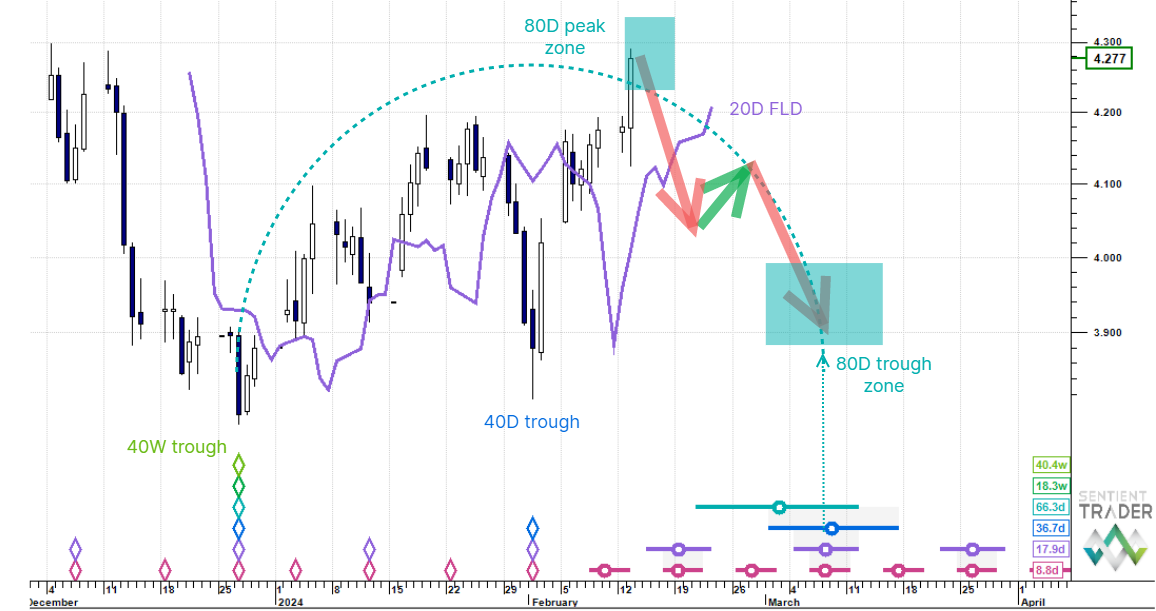
S&P 500
Finally the US stock market succumbed to its “vulnerability to a downward fall” as mentioned last week, and on Tuesday the S&P 500 plunged down through the 40-day FLD, only to find support at the 80-day FLD, which then bounced price straight back up again. I have mentioned often here the phenomenon of FLD lines providing support to price, and so that move was no particular surprise. The projection from the cross below the 40-day cycle FLD was to a level of 1345, and it achieved that before close of trading on Tuesday, without crossing the 80-day FLD, highlighting a subtle imperfection in the cascade pattern I pointed out last week (true cascade patterns result in the crossing of the next FLD in fulfilling the projection from the previous FLD cross).

Crossing below the 40-day FLD confirms the peak on 29 February 2012 as being of at least 40-day magnitude, and my preferred analysis continues to place the 20-week cycle trough on 30 January 2012. The trough on Tuesday 6 March 2012 was 36 days after the 30 January 2012 trough and it seems very likely that was the first 40-day cycle trough in the current 20-week cycle. Price will bounce up a little (providing renewed optimism for the bulls), but then should fall below the 80-day FLD to form the 80-day cycle trough at the end of March or early April, and then finally drop into the 40-week cycle trough towards the end of May.

Only 157 days have passed since the 4 October 2011 trough, and so it is not impossible that this alternate analysis is playing out:

It is possible that the 6 March 2012 trough was in fact a trough of the 20-week cycle (it is just in that green box on the above chart), but if not then this analysis would require price to drop fairly hard fairly soon to form that overdue 20-week cycle trough. How soon? Note the bar counts on the 80-day and 40-day cycle troughs. They are becoming stretched, and the trough would have to occur within the next three weeks for the analysis to remain valid. I think this is less likely to be the true cyclic story, but it would be irresponsible of me not to point it out. I will be watching that 80-day cycle FLD. If price breaches it too soon then we should be alert to the possibility that this analysis is the true one.
Euro/US Dollar
Sometimes a market will behave as if it’s been studying Hurst’s Cyclic Principles for itself. At the moment the Euro/ US Dollar forex pair is behaving like that. This week it most probably formed the 20-day cycle trough (discussed last week) on Wednesday 7 March 2012. The chart tells the whole story:

It is possible that 20-day cycle trough will occur early next week, and only then will we be in the final 20-day cycle of the current 80-day cycle. That 80-day cycle trough is expected at the end of this month, or early April, and of course this 20-day cycle should have a bearish shape, so we expect lower Euro prices by that time. It is possible that the 20-day cycle will prove to have occurred on 7 March 2012, and that we have already seen the peak of this bearish-shaped 20-day cycle. Either way, it is best to keep in mind that financial markets, like young children, cannot keep up their good behaviour for very long!
Gold
Gold spent most of the week below $1700, and the peak on 28 February 2012 seems likely to have been the peak of the 20-week cycle as discussed last week.

I will be watching the unfolding of the current 80-day cycle with great interest because it will help us to resolve the magnitude of the peak on 6 September 2011, as of either 54-month or 18-month magnitude. I continue to favor the latter, implying higher gold prices within the next few years.
Why will I be watching this 80-day cycle? The shape of the current 80-day cycle should tell us more about the underlying trend which is molding the cycle. We know that the 20-week cycle is pushing down (following the 28 February 2012 peak), and the 40-week cycle is pushing up (rising towards a peak expected July this year), and the 18-month cycle is pushing down (still falling from the 6 September 2011 peak). That is two cycles pushing down, and one pressing up, implying that we should expect a bearish shape for the current 80-day cycle, but if the 54-month cycle is also pressing upwards we might see a bullish cycle unfold, providing us with the vital clue we are looking for.
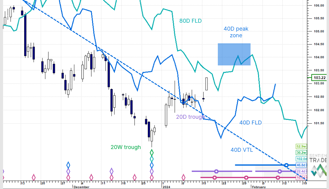
30 Year US Treasury Bonds
168 days have passed since the 23 September 2011 18-month cycle peak in bonds. The 20-week cycle peak has almost certainly occurred, but as price flounders about in the FLD congestion zone, Sentient Trader is reluctant to pin that peak triangle onto the chart. As well-behaved as the Euro/US Dollar forex pair is being, the bonds are not behaving at all!

Because the 20-week cycle peak has most probably occurred, we can expect lower prices over the next few weeks, but until the cyclic picture becomes clearer it is best to avoid this market altogether.
Crude Oil
I am introducing a new analysis this week: Crude Oil. The first question I always ask when performing a new analysis is “which way up” should the analysis be done? Hurst’s Cyclic Principles state that “troughs are synchronized”, but of course in several markets it is actually the peaks that are synchronized, and the analysis needs to be performed “upside down”, as is the case with Gold and most commodities. Often one can tell which way up an analysis should be performed simply by looking at the chart and identifying either sharp isolated troughs and rounded clustered peaks or vice versa. However in the case of Crude Oil the chart doesn’t provide any clear clues. There are sharp isolated peaks (July 2008) and sharp isolated troughs (January 2009). Of course the price of Crude Oil is quoted in US Dollars (as is Gold), and so there is the complex interaction of not only the cycles that influence the price of Crude Oil, but also the cycles that influence the US Dollar’s value (which was at a very low value in 2008, hence possibly the high price for Crude Oil).
When the answer to the “which way up?” question is not obvious, I try both and let the analyses speak for themselves. And so here for your consideration are both analyses. Let’s start off with the synchronized troughs:

This analysis places a trough of the 54-month cycle in January of 2009, and oil is currently tracing out the third of the three 18-month sub-cycles of the current 54-month cycle, which is expected to trough some time in 2013. The most recent 18-month cycle trough was on 4 October 2011, and we are now 23 weeks into the current 18-month cycle.

Notice how long the 54-month and 18-month cycles are in this analysis. In fact they are only 12% and 13% long respectively, which is not necessarily a problem, and the synchronicity of the 4 October 2011 trough encourages me to believe that the synchronized trough analysis is the correct one, but here for the sake of completeness is a synchronized peak analysis:

This analysis pins the 54-month cycle peak in July 2008, and has oil in the third of the three 18-month sub-cycles. The next 54-month cycle peak is expected at the end of this year, or early 2013. The current 18-month cycle started from a peak on 2 May 2011, and is 43 weeks along.

This mirror reflection between the synchronized trough and synchronized peak analyses is unusual, and is something that I have found one sees when performing short term analyses on triangle price formations (using the classical technical analysis definition). Triangle formations are, I believe very hard to analyze correctly using Hurst’s Cyclic Principles because of the numerous troughs or peaks that are possible candidates for cycle troughs or peaks, and the fact that FLD’s quickly develop into congestion pause zone patterns as we are seeing currently in the US bonds. Is it possible that Crude Oil is tracing out a massive multi-year triangle pattern? It is possible, but fortunately it is at a scale that won’t affect our analysis.
Which is the better analysis? I favor the synchronized trough analysis, and am encouraged in this by the recent synchronicity between US stocks and Crude Oil, but I will continue to keep an eye on both analyses in case the cycles choose to turn themselves over!