The US markets are poised for a reversal to the downside. Our analysis has been looking towards this peak ever since the identification of the 40-week cycle trough on 4 June 2012. Peaks are notoriously complicated when analyzing the markets according to Hurst’s Cyclic Principles because of the principle that troughs are synchronized (and therefore, with a cyclic model with harmonically related wavelengths, peaks are not synchronized). Therefore when approaching a peak in the market a Hurst analyst often repeats the phrase “expecting a peak to form”. It is my experience that the market will continue to rise (or fall) just beyond the point at which one begins to doubt the analysis, and then it makes the turn.
It is important to question analyses constantly of course, but that uncomfortable feeling that perhaps one is wrong is usually a sign that the market is about to do exactly what you expect. Novice traders experience this frequently – the market behaving as you expected immediately after you decide you must be wrong and exit the trade. Experienced traders are the ones who survive this experience and know to be tenacious, as long as their analysis proves to be correct of course. And so let’s review the analysis.
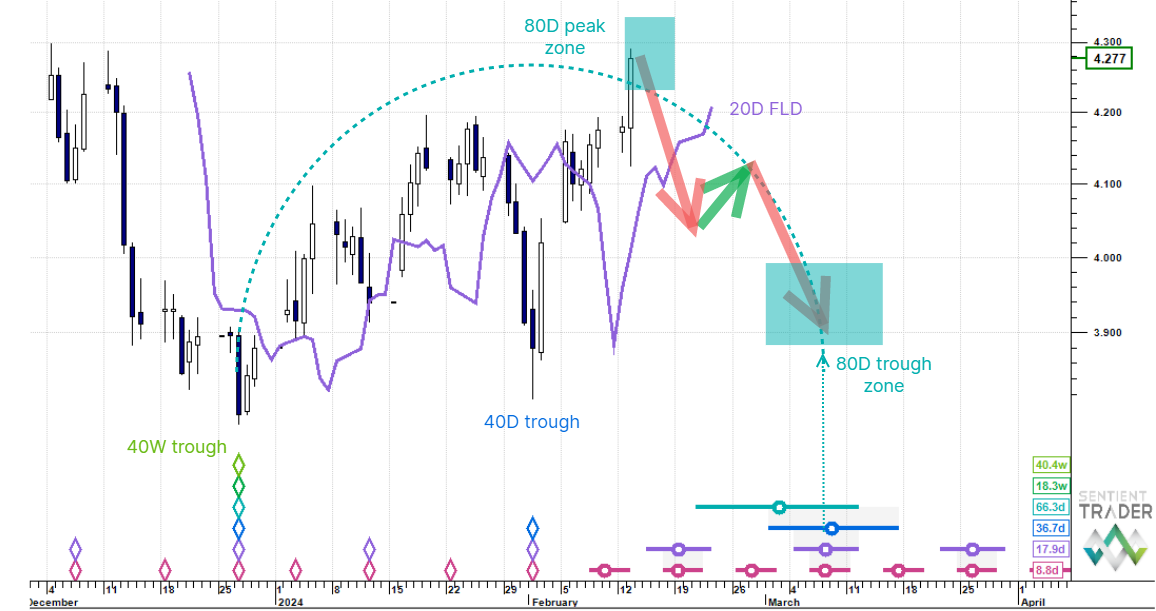
S&P 500
In recent weeks I have presented options around the placement of the 40-day cycle trough. Here is the most likely analysis in my opinion:

Note that I have included multiple FLD’s on several charts today because they are beginning to display upward cascade patterns which reinforce the potential for a downwards reversal. The patterns are all subtly different, with gaps apperaing in some of them, indicating areas where price is likely to pause on its way down.
The above analysis indicates that an 80-day cycle trough is now overdue, and would prove to be the correct analysis if price moved sharply downwards next week. It is therefore an immediately bearish analysis. Here is the alternate analysis which is less immediately bearish:

Here you can see that the 40-day cycle trough has been positioned on 25 July 2012, as discussed in previous ST Outlooks. This implies that we have another 10 days or so before the 80-day cycle trough forms, giving the market a bit more room to complete its upward move. The result of this would be a long 80-day cycle of course, as shown graphically by the staggered nest-of-lows with the 80-day cycle “circle and whiskers” sitting on its own to the left of the rest of the nest-of-lows. This is not as aesthetically pleasing as the above analysis, but aesthetics don’t always win the day!
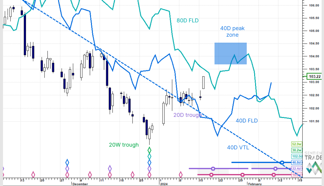
Nasdaq
The Nasdaq shares the above two analysis options, and I have been presenting the third option here, which is that the trouigh on 25 July 2012 was an early trough of the 80-day cycle. And so here is that analysis again:

This analysis indicates that price will be falling into a 40-day cycle trough after forming its peak. Remember that the two options presented for the S&P 500 also apply to the Nasdaq. Here is one of them:

Note the nest-of-lows (circled in red on this chart) which is the same nest-of-lows that I accused of being unaesthetic in the S&P 500. Here it is a perfectly valid (perhaps even aesthetic) nest-of-lows, which serves as a reminder that one should not necessarily dismiss an analysis purely on the grounds of aestheticism.
If these three options in the US markets are causing “analysis dissatisfaction” I would like to point that the implications of all three options is effectively the same: We are expecting a peak to form! Here is the bigger picture showing the unfolding M cycle shape:

Euro/US Dollar
The Euro has been making heavy work out of the bounce from the 24 July 2012 trough. This week it tracked along the 20-day FLD which is a sign of its weakness. The 20-day FLD provides natural support following the formation of a trough of 80-day or greater magnitude, but a healthier cycle (one with less bearish underlying trend) would be well above the 20-day FLD at this point.

The Euro should pull itself clear of the 20-day FLD to the upside, but I remain bearish in the medium term, and this reliance on the 20-day FLD reinforces the bearish outlook.
Gold
The same two possibilities we have discussed in previous ST Outlooks remain viable. I am presenting a contradictory picture in today’s chart: an analysis that pins the 40-week cycle peak on 31 July 2012, and the other option presented as idealized W-shapes (not M-shapes because this analysis is inverted as discussed previously)

The second W-shape is not yet complete, showing the possibility that gold has yet to form the 40-week cycle peak. It will need to do this soon, as a failure to do so will mean that the 40-week cycle peak positioned as shown in the above analysis is likely to be correct, and gold has fallen back into the hands of the bears.
30 Year US Bonds

Bonds have continued to fall from the 18-month cycle peak of 25 July 2012. As the US stock markets roll over to the downside bonds should rise into a 40-day cycle peak as indicated by the yellow arrow on the chart.
Crude Oil
Oil continued its rise as expected towards the 80-day cycle peak, expected to form at about the $100 level. On this chart I have shown the buy and sell turning zones for the 80-day cycle.

Commonality between markets is a constantly fascinating study. Oil’s perfect cyclic picture sheds some light on the cycles in the US stock markets, and provides a glimpse of a reason for their continued rise recently. It also warns of the impending peak. Yet another piece of evidence to reinforce our confidence in the analysis.
US Dollar Index
Recently we have been discussing the formation of the 20-week cycle trough in the US Dollar which might have occurred on 8 August 2012 as discussed last week. However the lacklustre bounce out of that trough suggests that we might have already seen the 20-week cycle trough, a possibility that I have kept mentioning. Here is that analysis:

The reason why this analysis is the less preferred option is because of the fact that the current 20-week cycle in this analysis should be less bullish than the previous 20-week cycle, and the higher peak of 25 July 2012 presents a picture that is not perfect in that it implies a more bullish cycle.
However bullishness of a cycle is an imperfect thing. The markets are not perfect themselves, and one of the most appealing aspects of performing an analysis using Hurst’s Cyclic Principles in my opinion is learning to deal with the imperfection of the markets. As Hurst himself said: analysis is sometimes more of an art than a science.
This leads perfectly to an interesting contrast I would like to make in conclusion today between Elliott Wave analysis and Hurst Cyclic analysis.
According to Hurst Cyclic analysis we are expecting the current peak (in the US markets) to form below the late March peaks, thereby setting the scene for a bearish 18-month cycle (as discussed in previous ST Outlooks). However as demonstrated in the above chart of the US Dollar, sometimes cycles aren’t perfect.
By contrast Elliott Wave analysis has an absolute rule: Wave 2 in a falling market cannot rise above the start of Wave 1. Many Elliott Wave practitioners are counting the fall from the March peaks as wave 1 of a bear market, with the current rise as wave 2. The peak must form at a lower level for the analysis to remain valid.
It is an interesting comparison between the analysis styles, but either way it would seem that a peak is inevitable.