S&P 500
The S&P 500 reluctantly squeezed out another few points this week, as the most likely analysis discussed last week suggested it would. Here is that chart again, updated to include this weeks lacklustre performance (and fundamentally weak – take a look at the ratio of advancing to declining stocks).

The exact placement of the 20-week cycle trough is not easy to determine because of the very subtle fluctuations in price over the last eight weeks, but I still favor the placement on 30 January 2012, because of the peak in 30 year US Bond prices on that date (see below). The above chart shows an alternate position for the trough, but it makes little difference to the analysis.
I continue to be intrigued by the possibility that we are witnessing the development of another 54-month straddled trough, as discussed previously.

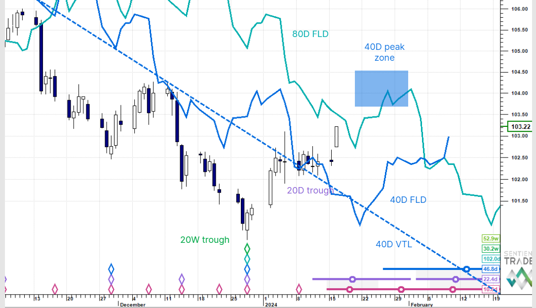
Euro/US Dollar forex pair
The Euro / US Dollar pair has been rising out of the 40-day cycle trough which occurred on 16 February 2012 as discussed last week. In the process the 20-week FLD has been crossed, and if prices maintain current levels into the start of next week, then the 40-week FLD will also be crossed, confirming that the trough on 13 January 2012 is of at least 40-week magnitude. My assertion in the 4 February 2012 ST Outlook that the 13 January 2012 trough was of the 18-month cycle is looking good, despite the troubles that Europe is having.

The 40-day cycle trough is not yet confirmed on the chart because of the fact that price did not fall below the 40-day cycle FLD, but by early next week the placement of the trough will be inevitable.
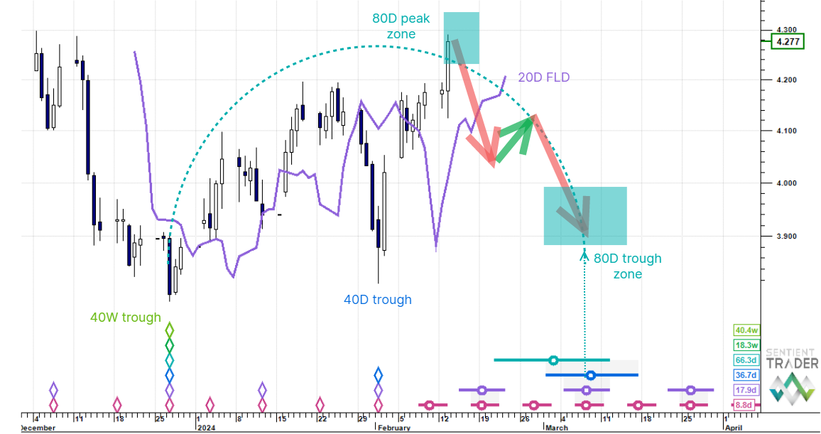
Gold
The bullish surge in Gold this week might mean that the placing of the 20-week cycle peak on 3 February 2012 was premature, resulting in this analysis:

Note that this requires a poor placement of the recent 80-day and 40-day cycle peaks, and so I still favor the analysis presented last week, placing the 20-week cycle peak on 3 February 2012. That implies that the recent move up is in fact the shape of the current 20-week cycle revealing itself, as I have mentioned over the past two weeks.
If this proves to be the case then the peak on 6 September 2012 is most likely of 18-month magnitude, and we can expect to see Gold moving up to the 54-month cycle peak expected in mid 2013.
If however price drops away from current levels then the 20-week cycle peak might be better placed at the more recent peak, and we will have to wait a little longer to see the shape of the next 20-week cycle.
30 Year US Bonds
I am going to start introducing analyses of additional markets, starting with the 30-year US Bonds. Today we will consider the “big picture”. The first consideration is “which way up” to perform the analysis. Here is a traditional Hurst analysis with synchronized troughs:

This analysis places us well into the final 40-week cycle of the current 54-month cycle, implying declining bond prices into the 54-month cycle trough expected mid 2012. Here is the analysis assuming synchronized peaks:

This is my preferred analysis, and I believe that it makes more intuitive sense to analyze bonds this way because of the contrary relationship betweens bonds and stocks.
The analysis claims the 23 September 2011 peak as one of the 18-month cycle (foreshadowing the 4 October 2011 trough in stocks by a mere 11 days). Bond prices have since become mired in an FLD congestion pause zone, but the long-term picture is very clear: bond prices are expected to rise to a peak of the 54-month cycle in early 2013, an analysis which is bearish for stocks of course, and which rings true when considered in conjunction with the second chart in this week’s post.
The more I consider the state of the markets, the more trepidation I feel for the period leading into the beginning of 2013. Take care out there!