From mid-November last year until the end of May this year the US markets moved upwards in a very narrow channel, effectively etching a straight line onto the chart. It was a frustrating 27 weeks for a cyclic analyst, because of course we rely upon the evidence of the various cycles’ up and down movement to understand where we are, and what to expect next.
Hurst’s Cyclic Principles describe how multiple cycle combine to influence the price movement of financial markets, and one of the basic tenets is that cycles never disappear, but they can be overpowered by longer cycles (as I discussed at the time, such as in this post). It’s all very well knowing that the cycles are still there, but when we cannot see them it is of little comfort to understand that the markets are simply in the grip of a dominant cycle. After periods of dominant cycle influence, when we find ourselves staring at the resultant straight lines on the chart, we are left struggling to find a clear analysis, simply because it is difficult to place troughs during that time with any confidence.
That is when I find a process used by Hurst to “extract” the cycle information very useful. It is a process that Brian Millard also wrote about a great deal in books such as Channels & Cycles (a tribute to JM Hurst). The process is simple: you remove the effect of a particular cycle by first applying a displaced moving average to the data, and then you calculate the difference between price and that average. The resultant data effectively has the effects of one (or more) cycles removed from it.
Here is the S&P 500 with a displaced moving average of two years applied to it. (The average is displaced because it is plotted at the center point of the range of data used to calculate it).

You can see that the displaced moving average reveals very clearly a long cycle (it has been projected up to the end of the data but I won’t tire you with those details). That long cycle is probably the 54-month cycle (or possibly a six-year cycle that I have written about before). That cycle is possibly the culprit (or one of the culprits) in the recent distention of price. And so I start by removing that cycle from the data. This is easily done by calculating the difference on each bar between the price and the displaced moving average. The result (loaded into Sentient Trader and analyzed) is this:

The big-picture analysis is (not very surprisingly, because we have removed only one cycle) the same analysis that we’ve been looking at here for some time. It is interesting to note the positions of the long 54-month cycle troughs, in August 2007 (as originally proposed by analyst “Airedale”) and October 2011. I’ve discussed reasons for that before (see this post), so let’s zoom in and take a look at the power of working with this data stripped of one potentially over-powerful dominant cycle:

Here you can see the cycle picture since July 2011. Stripping one cycle out of the data hasn’t removed all the imperfections of course (multiple cycles can be dominant at any one time), but the cycle picture does seem clearer. Here are the M-shapes of the 18-month cycle:

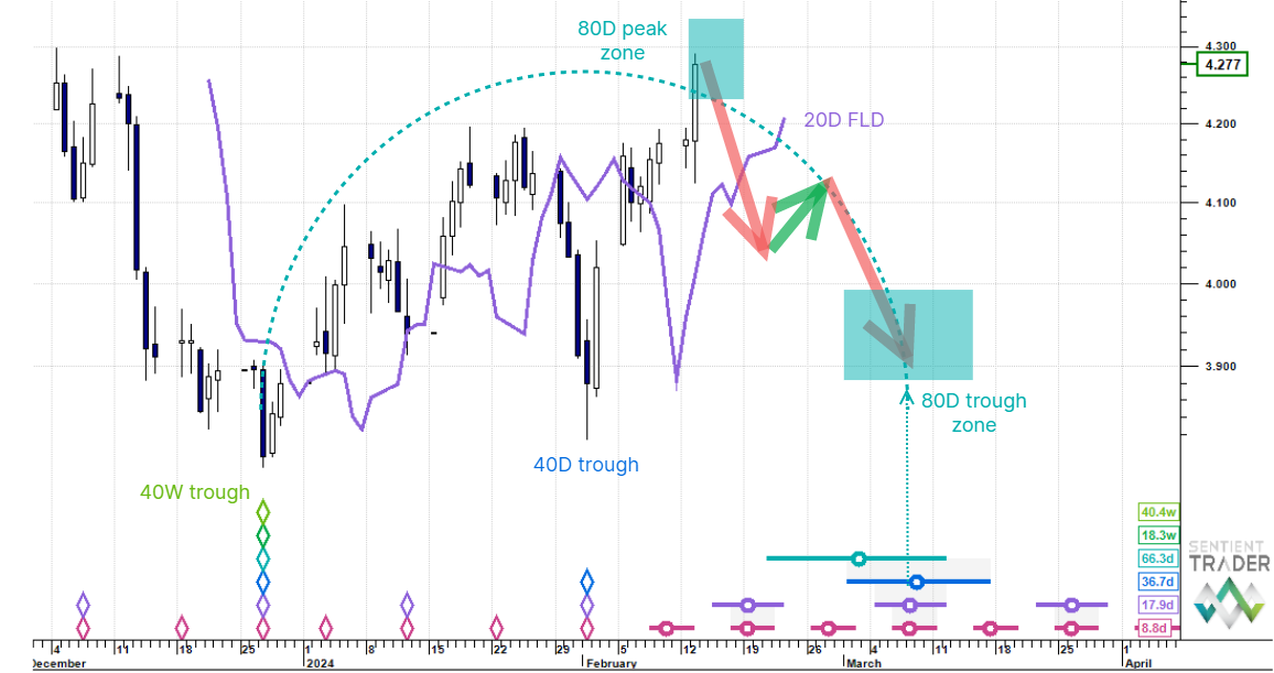
What is particularly apparent is the recent double-top formation around the 40-week cycle trough of late June 2013. Let’s zoom in further:

Notice how stripping out the long cycle has exposed more detail in the recent price action, making the analysis easier to perform. Here is the actual price chart over the same time:

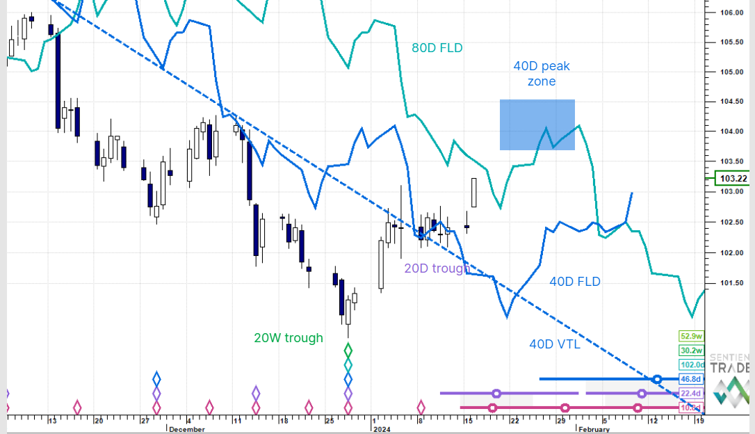
The analysis is the same (or very similar), but it looks less convincing because of the way in which the cycle that we removed was distorting the price movement at this scale. Let’s zoom in even further, and look at the recent price action:

A very clean 64-day cycle can be seen there (nominal 80-day).
I hope I have shown how useful it can be to remove a cycle from the data and to reveal the more subtle cycle action of other cycles. One can repeat this process, stripping away more cycles, and analyzing the results, but I am feeling confident enough with this analysis that it doesn’t warrant the effort.
One question remains: which cycle did we strip out? I used a two-year moving average which would have removed the next longer cycle, and so it was probably the 54-month cycle, but it would also have removed some of the effect of a six-year cycle (if there is one). In fact it doesn’t really matter which cycle was removed. The purpose of the exercise was to reveal the overpowered shorter cycles, and that was achieved.
I wish you all profitable trading.