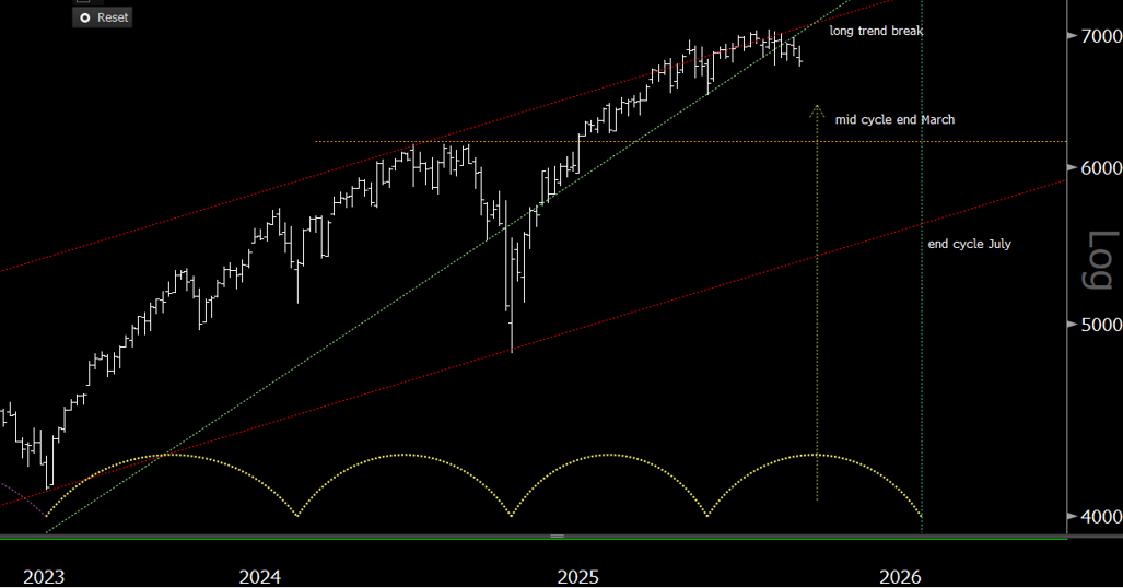
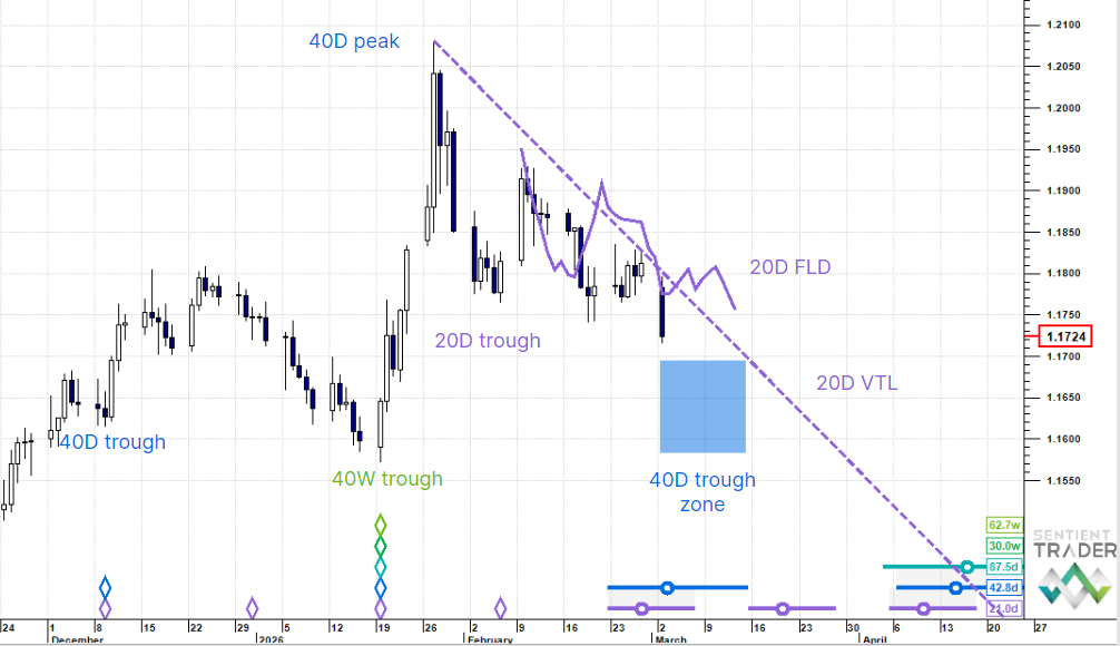
It is one of the distinguishing features of the Hurst Cycles approach that a cycle doesn’t disappear. It does suffer a constant variation to its wavelength, and it will sometimes get squashed or stretched by another cycle, but it never disappears. Whatever it is that causes the cycles we observe in the market keeps doing the thing it does to influence price movement, again and again.
However we know that sometimes it appears as if a cycle has disappeared, but this is actually a result of the cycle being squashed or stretched by a more powerful dominant cycle. The subject of cycle dominance is a fairly big one, and analysts have differing opinions about what a dominant cycle is. My approach is simple: a dominant cycle is the cycle that is most visually apparent on the chart, the cycle that creates the most obvious cycle shapes.
To receive these blogs as soon as they are posted Join/Like/Follow Us. If you don’t do social media – click to Join Feedburner to receive these blogs by email.
There are various ways of determining what cycle is currently dominant, and a reliable indicator I have found is when Peak Shadows are formed on the chart. Peak Shadows are a concept that I came up with (before you start trawling through the glossary of your Hurst Cycles Course). A Peak Shadow is formed when price and an FLD (Future Line of Demarcation), or two FLD’s, move together as a peak is formed, resulting in something that looks a bit like a drop shadow has been applied to the price movement (or to the FLD). Here is a chart of the S&P 500 (ES futures contract) which shows the formation recently of two clear peak shadows between price and the 80-day FLD:

The second, or current peak shadow isn’t complete yet and might turn out not to be a peak shadow at all, but simply a time when price tracked along the FLD. For it to qualify as a peak shadow price must follow the FLD down a little way. (If it doesn’t do that then it will not be a peak shadow, but a B-category interaction on a larger scale, implying some further upside movement before the move down to the June 20-week cycle trough)
We are at an interesting point now in the markets because there are in fact two peak shadows potentially developing. Here is the second one, between the 80-day FLD (cyan colored line) and the 20-week FLD (dark green line):

Peak shadows form because of the M-shape of cycles, which has the natural result that the FLD (projected forward from the first peak of the M) “shadows” price as it forms the second peak of the M. However it only does this accurately when a cycle one degree longer than the FLD creating the shadow (or the longer cycle when two FLD’s are shadowing one another) is dominant.
And so both the charts above tell us the same thing: the 20-week cycle is dominant at the moment. (Caveat: the peak shadow between price and the 80-day FLD shown in the first chart is not yet confirmed.)
What does this mean in terms of making trading decisions? I mentioned that a dominant cycle is “visually apparent” on a chart, and so if the 20-week cycle is dominant then we would expect it to be a clearly formed cycle on the chart, following the curve shown here with a dashed red line:
If it is dominant then we would expect to look back in June and see a clearly formed cycle, not a squashed cycle, or one that doesn’t form a deep final trough. And so effectively knowing that the 20-week cycle is dominant warns us that we are about to see a strong move down into the 20-week cycle trough expected in June.
The other thing to be said about dominant cycles is that they tend to form well balanced, fairly symmetrical M-shapes. Here is a chart showing what that implies for the next six weeks or so:
Of course this downwards projection is based on the fact that the 20-week cycle is dominant. If price doesn’t follow that 80-day FLD down within the next few days then the peak shadow will be invalid and we will need to reconsider the dominance of the 20-week cycle.
Have a great week and profitable trading!


