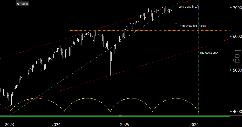
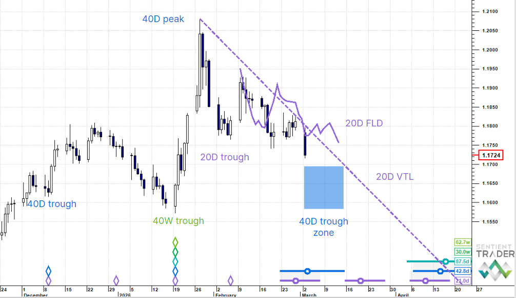
Five weeks ago I published a post which presented a simple method for calculating the “bullishness” of the market as expressed in the cycle shapes, and I presented this chart for the S&P 500:
Here is an update of that chart:
To receive these blogs as soon as they are posted Join/Like/Follow Us. If you don’t do social media – click to Join Feedburner to receive these blogs by email.
I won’t explain those numbers again because you can read about them here. I am showing here the analysis that expects the 80-day cycle trough to form soon, and the yellow numbers are the “bullishness” ratings of the cycle shapes assuming that Friday was that trough. By making that assumption we can see how accurately the market is expressing the cycle shapes, and gauge the validity of the assumption. You will recall that we were expecting an 80-day cycle with a 63% bullishness (a reflection of the 37% bullishness of the cycle that preceded the early February trough).
66% is pretty close and I wouldn’t be surprised to see the 80-day trough form soon, but another week to 10 days of downwards movement, carrying price to the 1780 region would bring the bullishness down to 63%. The market does not always express itself with such accuracy however.
It is worth mentioning that the alternate analysis I have presented over the past few weeks is still a valid alternate, although this analysis presents cleaner cycle shapes.
The important question is what will happen next? The next 80-day cycle should have a lower bullishness rating (or higher bearishness rating, depending which way you look at it) because it is on the downside of the 20-week cycle, and so the bounce out of the 80-day cycle trough might be disappointing, and we will probably see deeper lows as the 20-week cycle forms a trough at the end of May.
Have a good week and profitable trading!


